Overview
Report Manager allows users to maintain printed and grid reports. This includes adding new, editing existing, and deleting old reports.
Security
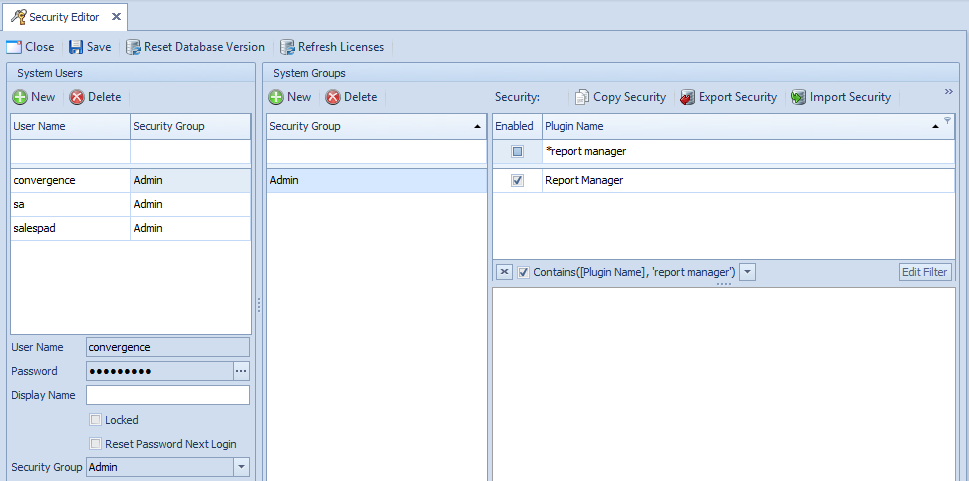
To enable Report Manager in DataCollection, go to the Security Editor (Modules > System > Security Editor) and filter to Report Manager. Make sure Report Manager module is checked for the desired user group and save your changes.
Log off and log back in for changes to take effect.
Usage
Once you have restarted, go to the top left corner and click on the Modules icon. A dropdown will appear.
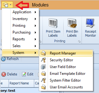
Go to System > Report Manager and the Report Manager will pop open as shown in the screenshot below.
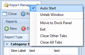
Note: If you want to have report manager open automatically, right-click and select Auto-Start
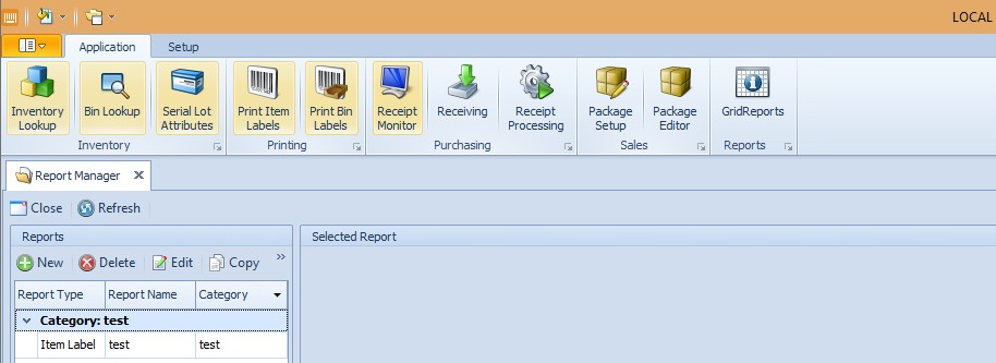
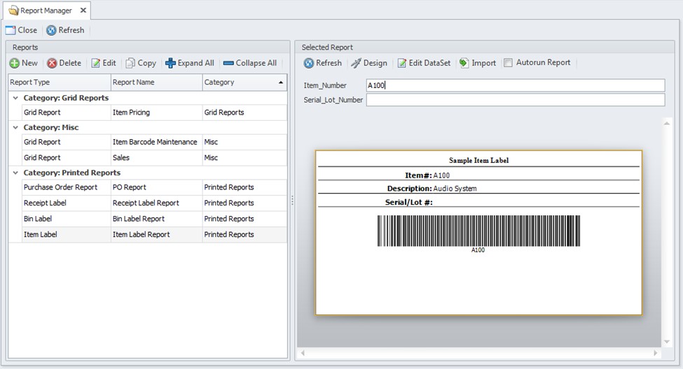
Report Manager Screen
Once you’ve opened report manager with data, you will see the following screen.
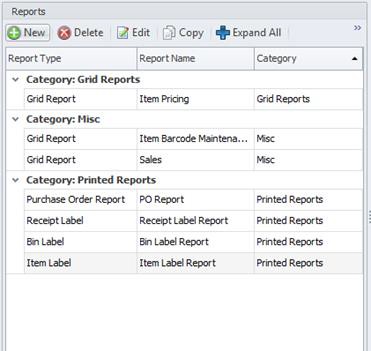
Reports Panel
Reports Panel is where reports are created, deleted, modified, and displayed.
- Delete – Permanently deletes the selected report.
- Copy – Duplicates the selected report with a new name and category.
- Expand/Collapse All – Maximizes or minimizes the category lists, respectively.
- Category – Organizes the reports based on the user-defined Category field. It is possible to have different types of reports (grid reports and printed reports) under the same category.
Creating a New Report
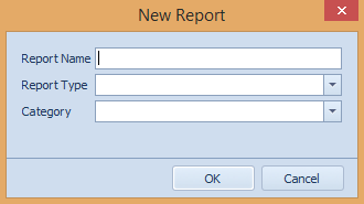
The New button will open the New Report Window allowing the user to create a brand new report. To create a new report, follow these steps:
- Click New in the Reports Panel. The New Report window will appear
- In the New Report Window, enter the report name, report type, and category
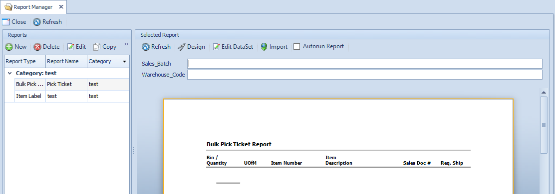
The report will pop open. Now you can design, edit data, import data, and set the Autorun Report. You can also copy and enter the Sales_Batch and Warehouse_Code
Editing an Existing Report
Allows the user to change the report name and category. Report design cannot be changed using this function. To select an existing report, click on another report in the category to open.
Selected Reports Panel
In this panel, reports are set up and formatted. The user interface may change depending on the type of report.
Printed Reports
Design Options
There are a variety of options to design a report that fits your specifications.
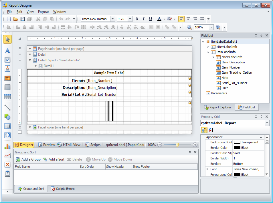
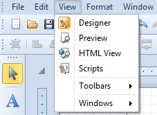
Views
The different views will give the users a different output for their report. The Design view is the default when opening the report designer. You change the view at the top or the bottom of the designer.
Top
Bottom
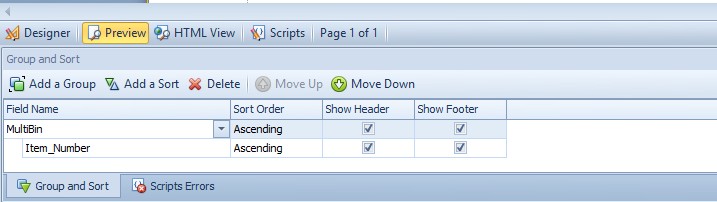
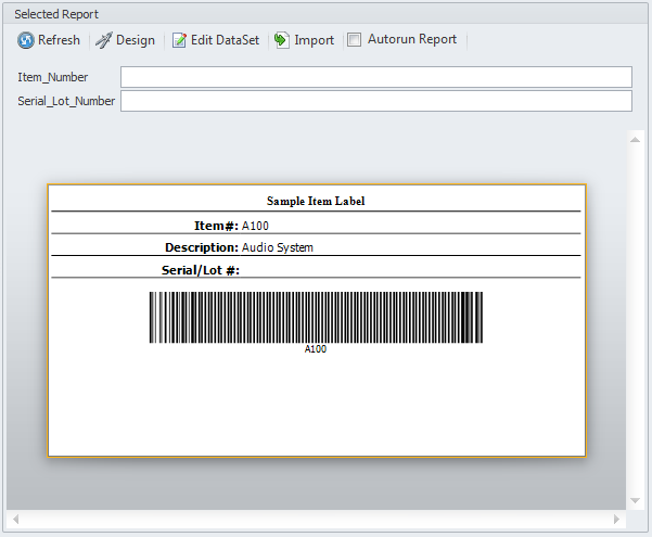
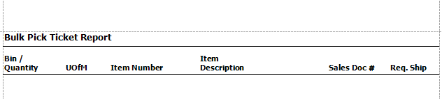
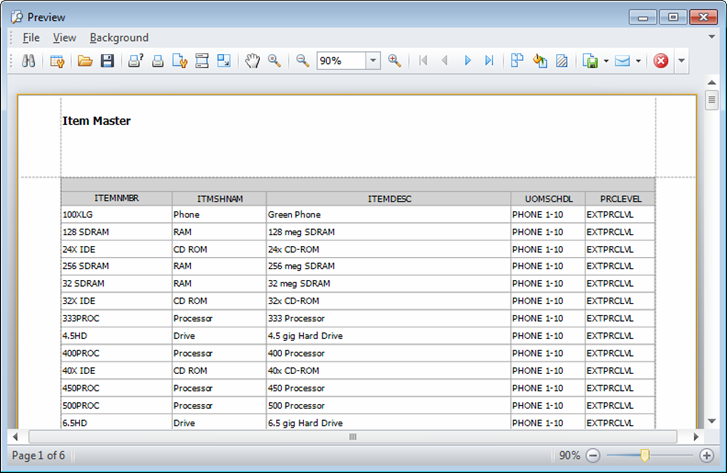
Preview View
By switching to the preview view, you will be able to see what your printed form will look like (see example below). You will not be able to edit in this view.
HTML View & Scripts
HTML View will allow you to see how the form will look in HTML. From the Scripts window, you can attach scripts to modify the behavior of the report in certain circumstances.
Toolbars
There are a variety of different toolbars in the report designer. Toolbars can be rearranged by dragging them on either end.

From Left to Right the buttons perform the following functions
- Pointer – The selection tool for grabbing and controlling specific areas of the report
- Label – Creates identifiers known as “labels”
- Check Box – Inserts a Checkbox in your document
- Rich Text - Creates a rich textbox
- Picture Box – Creates a box where pictures can be dropped
- Panel - Container that frames separate report controls to allow them to be easily moved, copied and pasted, and visually unites them in the report preview (with borders or a uniform color background).
- Table – Allows a table for information to be placed in the document
- Line – Creates a line
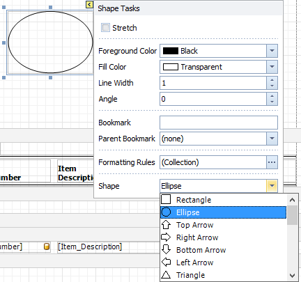
- Shape – Creates a variety of shapes
Note: Shapes can be changed by clicking the arrow at the top of each shape. See screenshot.
- Bar Code – Inserts a barcode label. The labels can be modified similar to shapes by clicking the arrow
- Zip Code – Inserts a zip code marker
- Chart – Inserts charts into the document
- Sparkline – Creates a line that can be modified to represent different data sets
- Pivot Grid - Allows you to create a pivot table, an Excel-inspired data visualization application for multi- dimensional data analysis. Using the Pivot Grid, large amounts of data can be summarized and represented in a cross-tabular format that can be sorted and filtered. Also, since the Pivot Grid provides customization at runtime, end-users can freely change the layout of the report based on their analysis requirements, using simple drag-and- drop operations.
- Subreport - Used to embed reports into each other. This allows you to reuse reports, create side-by-side reports, and create master-detail reports.
- Table of Contents – Inserts a table of contents into the document
- Page Info – Inserts page info into the document
- Page Break – Inserts a page break
- Cross-Band line - Used to draw a vertical line which is not restricted to a particular band, but goes from the cross band control.start point to the cross band control.end point, crossing the bands between.
- Cross-Band box - Used to draw a rectangle, which is not restricted to a particular band, but goes from the cross band control.start point to the cross band control.end point, crossing the bands between.

- To Grid – Align the positions of the selected controls to the grid Lefts – Left align the selected controls
- Centers – Align the centers of the selected controls vertically Rights – Right align the selected controls
- Tops – Align the top of the selected controls
- Middles – Aligns the centers of the selected controls horizontally Bottoms – Aligns the bottoms of the selected controls
- Width – Make the selected controls have the same width Size to Grid – Size the selected controls to grid
- Height – Make the selected controls have the same height Both – Make the selected controls have the same size
-
Make Equal – Make the spacing between the selected controls equal Increase – Increase the spacing between the selected controls Decrease- Decrease the spacing between the selected controls Remove - Remove the spacing between the selected controls
- Horizontally – Horizontally center the selected controls within a band
- Vertically – Vertically center the selected controls within a band
- Bring to Front – Bring the selected controls to the front
- Send to Back – Move the selected controls to the back
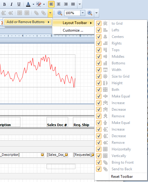
- Add or Remove Buttons Dropdown – See Screenshot. Customizations are available from this menu
- Zoom Out – Zoom out of the design surface
- Zoom – Select or input the zoom factor
- Zoom In – Zoom in the design surface
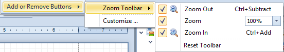
- Add or Remove Buttons Zoom Dropdown – See screenshot. Customizations are available from this menu
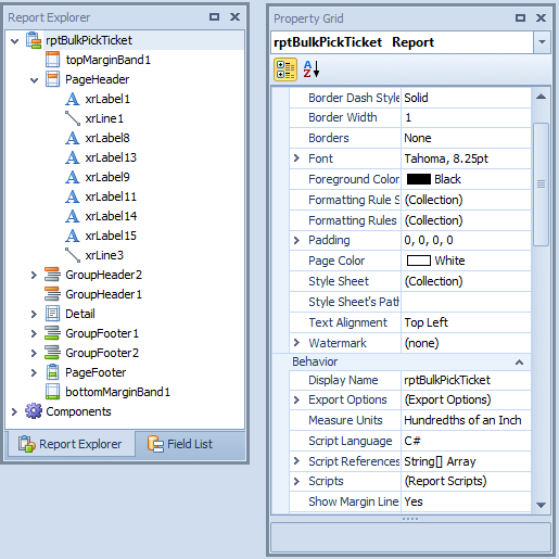
The Report Explorer will allow you to see where objects are structured on your document and will allow you to select certain objects in the document.
The Property Grid provides more in-depth options for designing your reports.
Actions Toolbar
- Refresh – Updates any informational or layout changes made to the report.
- Design – Opens the Report Designer, allowing users to modify the report design and overall layout. Report Designer can also be used to export the report as *.repx file.
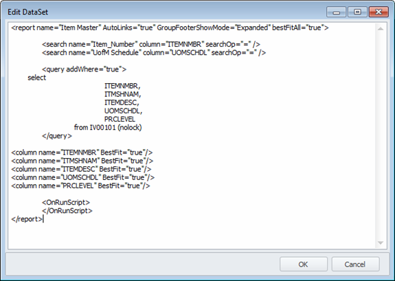
- Edit DataSet - Opens a text editor where users can change the dataset for the report. Note that the dataset does NOT have to be altered to change the layout/contents of the report.
- Import – Allows users to import existing *.repx files. Note that this option permanently overwrites the current layout of the report.
- Autorun Report - Determines if the report will automatically update data when it is selected from the Reports Panel.
Grid Reports
For complete documentation on Grid Reports see the documentation here.
Actions Toolbar
- Refresh - Runs the grid report and updates any changes made to the report.
- Design - Opens a free-text editor window, allowing users to modify XML and SQL text in which the report is written. For a complete list of available XML attributes and tags, please refer to SalesPad Quick Reports Reference Guide.
- Edit DataSet – Opens a text editor where users can change the dataset for the report.
Note: that the dataset does NOT have to be altered to change the layout/contents of the report. - Reset Layout - Resets any layout changes made to the report to the default setting.
- Import - Allows users to import an existing *.xml or *.sprept file to create a new report.
- Export - Exports the report data into an Excel file.
- Print - Opens a Print Preview window allowing users to print grid report data.
- Autorun Report - Determines if the report will automatically update data when it is selected from the Reports Panel.
SalesPad Support
Comments