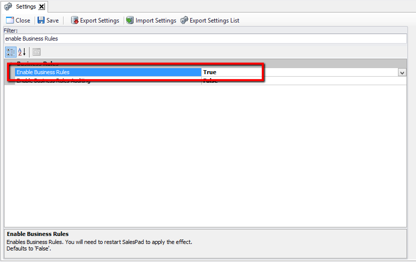
Note: This feature may not be in versions prior to 4.1.
Overview
The Item Class Report module provides a graphical representation of item sales by item class for a given date range, in terms of dollars, quantity, price, and/or margin. The Item Class Report module will display data as both a bar graph and as raw data displayed in a spreadsheet.

Security
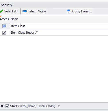
In the Security Editor, Item Class Report must be enabled:

To display Cost and Margin for an item class, set Show Cost to True. Otherwise, this column will be hidden.
Use
 Go to Modules > Inventory > Item Class Report to open the module.
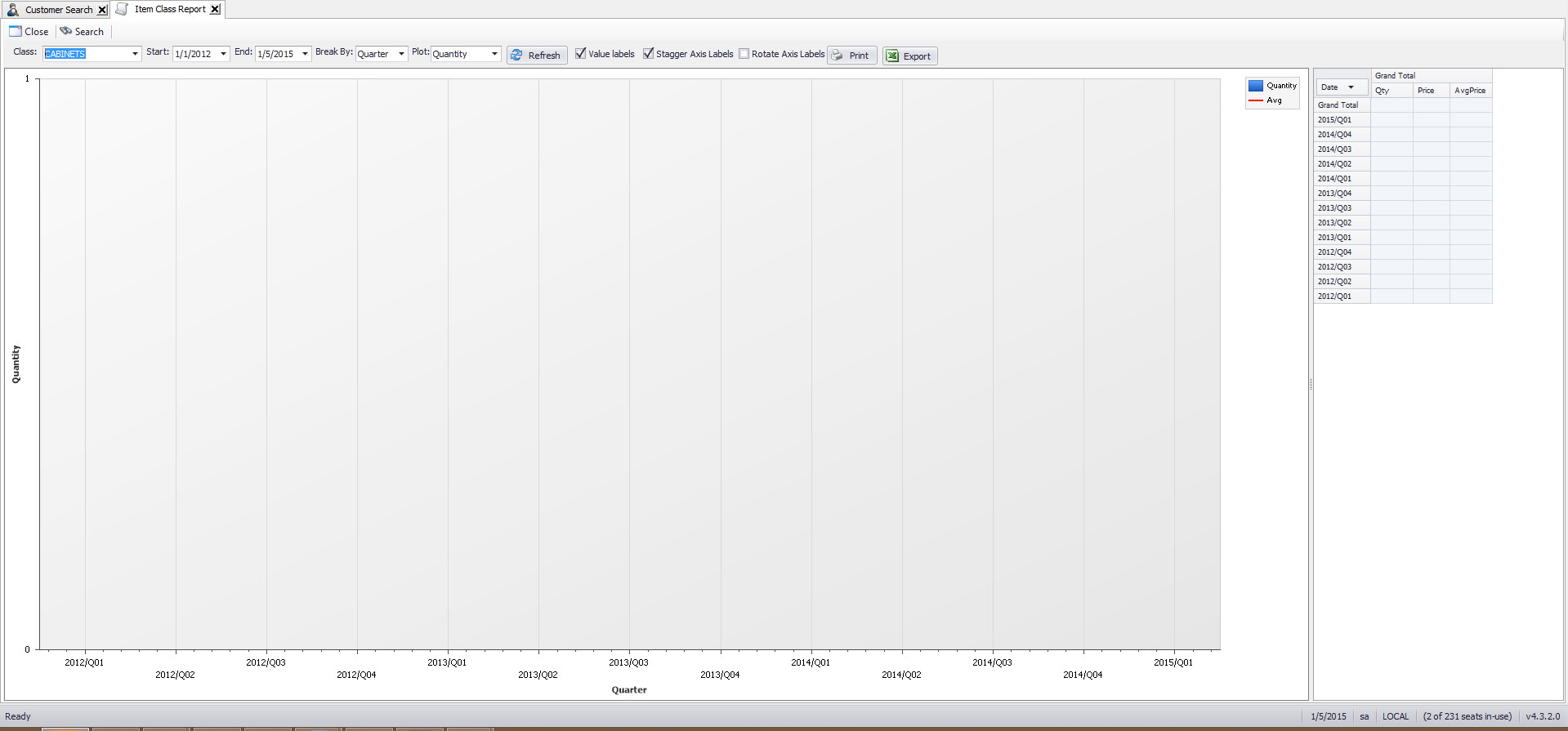
The graph and spreadsheet will be blank. Enter and select the appropriate specifications to display the graph as desired:
Class: Enter an item class to display, otherwise leave this field blank to pull data from all item classes.
Start:/End: Choose the start date and end date for the time period to display.
Break By: Set the interval that will be displayed on the graph and spreadsheet (Day, Week, Month, Quarter, or Year).
Plot: Select to display Quantity, Price, Cost, or Margin on the graph.
Note: Cost and Margin will not be options if Show Cost under Item Class Report is False in the Security Editor
Value Labels: If checked, the numerical values of each column will be displayed.
Stagger Axis: If checked, Labels will be staggered. This is useful when a longer timeframe is selected, to make the display easier to read.
Rotate Axis: If checked, the labels will be displayed vertically instead of horizontally.
Value Label:

Staggered Axis:

Non-Staggered Axis:

Rotated Axis:

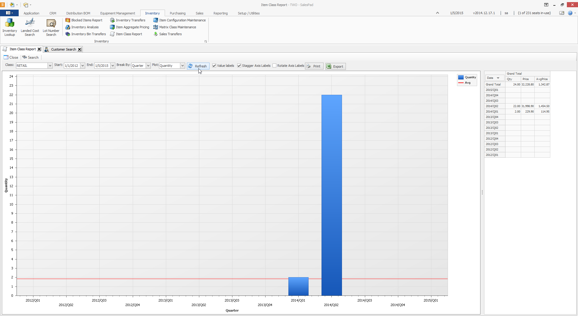
Click Refresh to display the graph with the selected criteria:
Use the Print button to print the graph. A print preview will open, which can be saved, printed, emailed, etc. Use the Export button to export the spreadsheet to Microsoft Excel.
Make adjustments to the criteria and display as needed, and click Refresh each time to update the display.
SalesPad Support
Comments